Recorded from ABB charger:
starting battery in %
ending battery in %
total energy in kWh
elapsed time
Car shows miles. Recorded from car:
starting miles
ending miles
I started with recording the date and time and ambient temperature, but I got lazy and those records are spotty (only for the first one). But above data have been recorded on almost every DCFC session.
Look of raw data
What do you do with so much data? Why you generate figures, of course. We are visual creatures, and we love curvy figures. This is why strip clubs are profitable; we go there to stare at curvy figures! As with strippers, we’d rather look at real data, not fake ones (or pretend fakes are real). One way to do that is to look at the data from a known source. In this case, energy in kWh and charge time in minutes are strictly from the charger, and independent of the car. That’s what I plot first.

All data and analysis are completely subjective, probably wrong, and should not be trusted!
I will give the raw data and source code to analysis, so you can judge for yourself how valid these may be. I find some strippers very pretty, so you may find the data and analysis presented here just as pretty.
Spotting fake
To get a better understanding, I infer average charge power (energy per unit time, aka division) over samples to see if there’s been any variations over time.

Then I go back to plotting charger-only data of energy vs time for samples 1 to 34 and 35 to end.

But a bigger question is, which data is closer to real, samples 1 to 34 or 35 to end? Apparently, I need more strip club training to spot the fake! Or in this case, I turn to even more powerful tool: guessing.
I have another piece of data to help determine which may be real, which is the efficiency reported by the car. Over the course of over 19K miles, SparkEV shows 5.3 mi/kWh. 16K miles shown, but it hasn't changed.


Here, we look at the average for each. For samples 1 to 34, average is about 5.75 mi/kWh (cyan line) while the rest are about 4.9 mi/kWh (magenta line). But remember, DCFC is not 100% efficient. From previous blog post about SparkEV being the most efficient car in world history, we estimate about 94% efficiency for DCFC.
http://sparkev.blogspot.com/2017/02/sparkev-is-most-efficient-car-in-world.html
Then we plot 5.3 mi/kWh (green line) and 94% of that (~5 mi/kWh, red line). It seems first set of data to sample 34 is fake. It’s a not a problem; with advances in science, Dr. SparkEV will simply perform a surgery to make it come into shape as the real data so that power vs samples look pretty. There’s no fake data here!

Curvy figures with angular jags
There are many things one can infer from the data. First is various raw data over charge time, and some linear fitting.

The curve fitting is performed on data that had ending percent less than 85%, not on the entire data. Why not 80%? We’ll go over that in next section. But for now, you can see the linear fit shows 20 minutes of charging would give about 4% per minute (80% in 20 minutes), 3.76 miles per minute (75 miles in 20 minutes), 0.74 kWh per minute (14.8 kWh from charger in 20 minutes). Compared to L2 charging of 0.05 kWh from charger per minute (3.3 kW charger), DCFC is almost 15 times faster!
Charge taper
To get a better picture of charge taper, I plot average power (energy in kWh divided by charge time in hours) vs % charged. When the battery is above 80%, I would expect the power to dip, because that’s what I see at the charger if I’m staring at it.

In addition, I only recorded the total power after charging is done. That means all the readings are average of the entire charge session, not just to 80%. For example, had I started at 1% and charged to 90%, average power would be very high (45 kW?). But if I started at 80% and charged to 90%, average power would be much lower (25 kW?).
And the most relevant reason is that 85% gave pretty good looking fit. I could’ve used 86% of 84%, but they just didn’t look as good. There’s no fake data, just pretty data!
For total charge percent (red dots), the taper starts roughly about 70%. That means I typically started charging at over 10% battery and stopped when charge taper became significant beyond 80% state of charge.
For ending charge percent (blue dots), it shows bit over 80% begins to taper. Most charge sessions end above 80%, but less than 90%. What this shows is that I charge near full power most times, not plug in when I already have 80% battery and make others wait while the car has severely tapered, unlike some (many) Nissan Leaf drivers plugged in when they already have 90%.
For few weeks (maybe few months), I was experimenting to see if I can only use DCFC without home charging as if I’m living in an apartment without the ability to charge at home or work. I did not want to inconvenience others, so I disconnected as soon as I saw another EV pull up. This is why there are several charge cycles less than 50% change (red dots), and most of those are above 42 kW on average, full power without taper. In other words, no one waited for me needlessly, and I went out of my way to be polite to other EV.
Overstuffing battery capacity
A question I had is if one sees reduced battery capacity as it’s charged fuller. For example, higher percent could use more cell balancing or more intensive battery management, thus slowing down the percentage as kWh from the charger increase.

However, there seem to be some erroneous data. Some show battery capacity more than 20 kWh, and one shows almost 15 kWh. Obviously, those are bad data. My suspicion is that I was looking at some pretty girl nearby, and recorded the wrong data!
I count about 6 data points too high and one data point too low, so they will be discarded.
Energy for percent
Now that I know what data to discard, I can plot other data, which is charger energy (provided by charger) vs percent charged (provided by the car). If charge taper did not expend extra energy, it should be a straight line.

Remember, I started logging the data after one year to second year, so this represents average battery capacity for day 365 to day 730 of car ownership. As such, it should be less than the peak advertised battery capacity.
Battery capacity degradation
Now comes the biggie: battery capacity over time. We know the average battery capacity for the year that I recorded the data, but how did it degrade? Unfortunately, I did not log the day/time, so I can only guess even distribution of charge events. Then we plot this for each data set. Remember, sample 0 (shown as sample 1 in plot, damn you Matlab!) is one year after I started driving SparkEV.

The curve fit is done using linear fit and exponential fit, and they look like they are on top of each other. Even if the degradation is exponential decay, such small number of samples would make it seem indistinguishable from linear. I suspect the actual degradation is exponential rather than linear, like much of natural processes. But linear is lot easier to interpret for us simple minds. We will discuss long term fitting later.
The graph shows that the battery was 18.1 kWh at beginning of the recording (1 year of degradation), and degrading about 0.007 kWh each sample (about half week). At the end of recording (2 years of degradation), battery has 17.3 kWh remaining. Average is about 17.7 kWh, which is close 100% capacity found in previous graph.
I took a more accurate reading of battery capacity about 2 months after recording started, and that showed 18.05 kWh. More recent reading showed 17.3 kWh, so it seems the battery is degrading according to the estimate. I will discuss battery capacity in more detail in some future blog post.
Of course, we’re looking at a tiny sliver of time, the reason why exponential decay and linear are practically the same.
Battery capacity degradation extrapolated
Now that we can see how well the data fits over samples, we can extrapolate for many years. Recall that the data collection started a year after getting the car and 104 samples (about 2 samples per week) over a year, and only estimated to be evenly spaced two DCFC charging per week. But that’s close enough to real usage for this blog post (you didn't pay for it, did you?), and we extrapolate for many years using the same battery degradation equation from before.
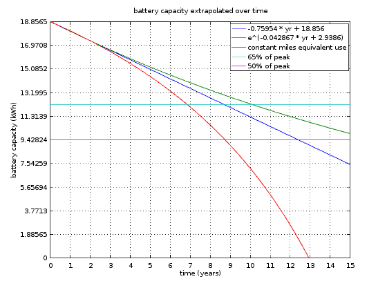
One thing clear is that curves (green, blue, red) diverge significantly after about year 5. That means you won’t be able to tell which path the battery degradation is following until then. But even then, noisy data will make it hard to tell maybe until 5% divergence; raw data is fluctuating about 1kWh total, so 0.5 kWh deviations would be apparent. Between blue and green, that occurs about year 8, the end of the warranty period. Between blue and red, that occurs about year 5.
Linear decay (blue) assumes same number of charging per given time interval for all time, 104 DCFC per year plus X number of home charging. But if I’m to keep driving same number of miles per year, there will be more charging. Simply, each charge cycle would be capable of fewer miles due to degraded battery, and more charging is needed to drive the same number of miles.
More charging per mile means more degraded battery. I plot this scenario as red plot. I made two known points to intersect: beginning of year 0 and ending of year 2. I suppose I could've made the intersection to be beginning of year 1 (first data collected) to end of year 2 (last data collected), but I chose year 0 and year 2 since they would generate worse degradation plot. Seeing how they are really close before about year 5 anyway, it probably won't make much difference either way.
The y-axis is divided into 10, so each represents 10%. To make it even easier to read, cyan line is 65%, and magenta line is 50%.
Life of a car
MrDRMorgan from SparkEV forum found that SparkEV battery warranty is to 65% in 8 years and 100K miles. If one follows linear trend (same number of charging per year, fewer miles driven each year), 65% would be reached well after eighth year.
If one has fewer charging events as time goes (much fewer miles), and follow the exponential decay curve (green plot), it could take bit over 10 years before hitting 65%. Unfortunately, this isn’t likely for most people, though some may get tired of frequent charging that they drive fewer miles with increasing degradation.
BUT if one drives the same number of miles by increasing the number of charging events, it could hit 65% in seventh year. That could trigger the warranty service. It’s unknown what Chevy will do if that happens: they may not replace the battery with a new one, but one that is barely above 65% that will take it to eighth year. In any case, this is an unpleasant scenario to avoid.
One might think that this is awful, but it may not be so bad. Biggest reason is that I have no idea what is the major contributor to capacity degradation. It may not be solely due to charge-discharge cycles that the red plot is based on. For most (all?) LiIon batteries, just letting it sit there would also cause degradation. If the major cause of degradation is time, then the degradation would follow blue curve (probably bit more since there'd be more charge-discharge cycles).
How do you tell if the major contributor to degradation is time or charge-discharge cycles? If there are same model year cars with much different number of miles (more or less charge cycles) and in similar climate and "abuse" that show similar degradation, that would indicate more of time dependence. Unfortunately, detailed battery capacity is hard to come by, not to mention finding other SparkEV with same usage pattern as mine.
Even if the battery has degraded beyond 35% (65% remain), car would still be usable. How much is it usable depends on how far the DCFC stations are spaced. Currently in SoCal, DCFC between San Diego to Orange County is about 30 miles apart, which means car must be capable of 40 miles (10 miles as margin). That’s about 50% capacity, although slow driving (55 MPH) could make it 40%.
Assuming no warranty service and looking at 50%, that occurs at about year 9 if driven same number of miles as current (red plot), year 12.5 if keeping the same number of charge events (linear, blue plot), and greater than year 15 if charging is reduced (fewer miles per year, green plot).
From my first blog post, I estimated the car to last 10 years in amortizing purchase price / lease price.
http://sparkev.blogspot.com/2015/05/first-of-all.html
It seems it can barely reach 10 years with careful driving.
But remember what I wrote earlier in this blog post:
All data and analysis are completely subjective, probably wrong, and should not be trusted!
Motivation
You might be wondering what prompted me to keep such meticulous data keeping after 1 year of use. I can assure you, it wasn’t because I wanted to put up with even more hassle of writing down charge data.
I use eVgo almost exclusively for DCFC. They give no receipt, and they didn’t even give a record of charging when I started using them in mid 2015. Couple of months later, they started sending emails of history of my usage, which they do about once a month. Fair enough.
Then about 1.5 year ago, I started receiving two emails that showed two different billing. There were much overlap in session records, and they replied to my inquiry that they were charging my credit card correctly. The rep replied that they would fix it, but it went on for many more months.
And then they charged me $5 out of the blue in addition to my monthly fee (including double billing)! I again inquired about the charge, to which the rep replied it was for something or another. I again asked them that there must be some error since I’m on $15/mo OTG plan and there’s no record of this $5 usage, but I never heard back from the rep.
I’m not happy about the poor customer service, but I didn’t bother pursuing the matter further as that could result in even more problems with billing or even bigger $$ charged to my account. Evgo is about the only DCFC available in my area, and losing that service via billing problem would mean unable to drive the car except to supermarkets. When you live in a glass house (or drive in glass charging infrastructure), it’s best not to throw stones.
From that point on, I decided to keep a record of DCFC sessions. Even if I can’t do anything about getting my money back, at least I’d know how much I’m getting ripped off. But keeping record has side benefits, which resulted in this wonderful blog post. Things don’t happen for a reason, but one can always turn a lemon into lemonade.
Appendix
As before, analysis is done using Octave. Copy-paste the code below to a text file and run it with Octave or Matlab. I keep it simple, and made it somewhat modular so I can reuse this with my next EV. Side benefit to that is that it can easily be used with other EV, too. As usual, sparse commenting.
close all; clear;
%raw data
pct_start = [13 26 52 30 22 34 32 12 21 29 10 5 12 27 15 45 31 8 10 20 20 52 16 54 11 5 13 23 16 45 16 26 23 6 19 9 40 21 13 10 15 25 16 14 40 11 11 66 14 18 55 17 32 23 27 27 37 16 12 52 25 35 17 34 11 23 16 7 29 14 40 39 32 20 10 16 28 36 31 34 13 16 20 11 22 16 15 18 10 16 56 14 27 33 48 23 10 34 21 13 18 13 16 51];
miles_start = [12 28 50 33 24 31 32 14 23 29 12 5 12 27 16 42 31 8 11 19 19 52 17 52 12 6 13 24 17 45 16 23 24 7 19 19 37 20 13 10 16 25 16 14 39 10 10 65 13 19 53 16 32 20 27 26 39 16 13 47 24 34 19 32 10 22 17 7 29 15 42 32 32 19 9 16 28 36 31 32 13 16 18 11 20 12 15 16 10 17 51 14 27 31 51 22 9 38 20 11 14 13 17 49];
pct_end = [85 82 87 85 70 86 84 83 61 85 86 85 93 89 68 85 84 83 87 83 64 84 69 83 87 90 83 81 81 85 94 92 94 94 84 85 77 93 89 85 83 84 83 83 81 90 80 82 83 80 83 89 84 86 83 83 79 85 76 84 83 85 83 86 85 77 75 95 82 50 85 80 81 82 81 88 89 81 87 85 85 82 84 90 86 89 84 80 81 78 83 81 82 82 84 88 83 80 81 85 85 85 85 83];
charge_kwh = [12.09 9.54 6.02 8.75 8.2 8.74 8.85 12.18 6.73 9.5 12.6 13.24 13.57 10.53 8.82 6.81 8.87 12.76 13.1 10.86 7.46 5.45 8.82 4.74 14.25 16.15 11.53 9.63 10.9 6.74 13.12 11.13 13.49 16.33 12.24 12.21 6.83 13.53 14.91 14.36 13 11.37 13 13.12 7.79 15.12 13.11 3.25 13.03 11.6 5.4 14 9.85 12 10.13 10.88 7.79 12.87 11.56 6 10.75 9.12 12.17 9.65 13.58 10.07 10.78 16.35 10.03 6.73 8.43 7.5 9.26 11.5 13.03 13.35 11.46 8.43 10.4 9.79 13.45 12.19 12.22 14.56 11.88 13.25 13 11.62 13.03 11.6 5.37 12.28 10.2 9.33 6.78 11.98 13.82 8.57 10.8 12.98 12.24 13 12.91 6.12];
time_min = [18 14 9 13 12 13 13 18 10 14 19 20 22 16 13 10 13 19 20 16 11 8 13 7 19 22 17 14 16 10 22 18 20 24 16 16 11 19 20 19 17 15 17 17 10 21 17 4 17 15 7 19 13 16 14 14 10 17 15 8 14 12 16 13 22 13 14 25 13 9 11 12 12 15 17 18 16 11 14 13 18 16 16 20 16 18 17 15 17 15 7 16 13 12 9 16 18 11 14 17 16 17 17 8];
miles_end = [83 82 86 81 68 81 80 90 65 86 87 85 91 86 66 79 83 82 89 82 64 83 66 80 86 95 82 79 79 84 92 87 88 91 81 83 72 87 85 84 83 82 82 81 78 84 74 77 77 77 78 83 80 79 80 77 74 78 70 76 76 76 82 84 77 71 70 88 76 50 85 73 74 71 71 79 83 76 81 79 78 74 75 83 77 76 73 70 70 71 76 76 77 80 83 82 77 76 74 75 69 70 82 80];
global plot_enable dcfc_efficiency_pct dcfc_per_year battery_waranty_pct year_started;
plot_enable = 1;
dcfc_efficiency_pct = 94;
dcfc_per_year = length(pct_start);
battery_waranty_pct = 65;
year_started = 1; % year data collection started; needed for battery extrapolate
idx0=35; idx_last=length(time_min);
%%%%%%%%%%%%%%%%%%%%%%%%%%%%%%%%%%%%%%%%%%%%%%%%%%%%%%%%%%%%%%%%%%%%%%%%%%%%%%%%
% DCFC changed from updating every second to every 10 seconds, and that also
% seedm to have changed power characteristics. Only look at relevant group data.
function analyze_data(idx0, idx1, ...
pct_start, miles_start, pct_end, charge_kwh, time_min, miles_end)
global plot_enable dcfc_efficiency_pct dcfc_per_year battery_waranty_pct year_started;
pct_start = pct_start (idx0:idx1);
miles_start = miles_start(idx0:idx1);
pct_end = pct_end (idx0:idx1);
charge_kwh = charge_kwh (idx0:idx1);
time_min = time_min (idx0:idx1);
miles_end = miles_end (idx0:idx1);
charge_pwr = charge_kwh ./ time_min * 60;
pct_charged = pct_end - pct_start;
miles_charged = miles_end - miles_start;
batt_kwh = charge_kwh ./ pct_charged * dcfc_efficiency_pct;
n=(1:length(batt_kwh))+idx0-1;
% pct charged vs time in min; can we really get 80% in 20 minutes?
idx_less_than_80pct = (pct_end <= 85);
time_min_polyval = 0:30;
pct_charged_poly = polyfit(time_min(idx_less_than_80pct), ...
pct_charged(idx_less_than_80pct), 1);
pct_charged_polyval = polyval(pct_charged_poly, time_min_polyval);
charge_kwh_poly = polyfit(time_min(idx_less_than_80pct), ...
charge_kwh(idx_less_than_80pct), 1);
charge_kwh_polyval = polyval(charge_kwh_poly, time_min_polyval);
miles_charged_poly = polyfit(time_min(idx_less_than_80pct), ...
miles_charged(idx_less_than_80pct), 1);
miles_charged_polyval = polyval(miles_charged_poly, time_min_polyval);
if plot_enable == 1
figure;
plot(time_min, pct_charged, 'b.', ...
time_min_polyval, pct_charged_polyval, 'b-', ...
time_min, miles_charged, 'g.', ...
time_min_polyval, miles_charged_polyval, 'g-', ...
time_min, charge_kwh, 'r.', ...
time_min_polyval, charge_kwh_polyval, 'r-');
grid on;
title('raw %, miles, energy charged vs charge time, ending under 85% fit');
xlabel('charge time (min)'); ylabel('%, miles energy charged');
legend('% charged raw data', ...
[num2str(pct_charged_poly(1)) ' * minutes + ' ...
num2str(pct_charged_poly(2))],
'miles charged raw data', ...
[num2str(miles_charged_poly(1)) ' * minutes + ' ...
num2str(miles_charged_poly(2))],
'energy kwh charged raw data', ...
[num2str(charge_kwh_poly(1)) ' * minutes + ' ...
num2str(charge_kwh_poly(2))], ...
'location', 'northwest');
endif
if plot_enable == 1
% charge power vs ending percent
figure; plot(pct_end, charge_pwr, 'b.', pct_charged, charge_pwr, 'r.');
grid on;
title('average charge power vs %');
xlabel('%'); ylabel('power (kW)');
legend('% end', '% charged', 'location', 'northwest');
% battery capacity over pct_charged; should not change much
figure; plot(pct_end, batt_kwh, 'b.', pct_charged, batt_kwh, 'r.');
grid on;
title('battery capacity vs %');
xlabel('%'); ylabel('battery capacity (kWh)');
legend('% end', '% charged', 'location', 'northwest');
endif
% battery capacity over time and curve fitting
% drop suspect data point, top 6 data points and bottom 1
batt_kwh_sorted = sort(batt_kwh, 'descend');
batt_kwh_top = batt_kwh_sorted(6);
batt_kwh_bottom = batt_kwh_sorted(length(batt_kwh_sorted));
idx_good_data = (batt_kwh < batt_kwh_top) & (batt_kwh > batt_kwh_bottom);
idx_bad_data = (batt_kwh >= batt_kwh_top) | (batt_kwh <= batt_kwh_bottom);
% charged kwh vs % charged after dropping suspect data points
charge_kwh_poly = polyfit(pct_charged(idx_good_data), ...
charge_kwh(idx_good_data), 1);
pct_charged_polyval = 0:100;
charge_kwh_polyval = polyval(charge_kwh_poly, pct_charged_polyval);
if plot_enable == 1
figure; plot(pct_charged, charge_kwh, 'b.', ...
pct_charged_polyval, charge_kwh_polyval, 'b-', ...
pct_charged_polyval, charge_kwh_polyval * dcfc_efficiency_pct / 100, 'r-', ...
pct_charged(idx_bad_data), charge_kwh(idx_bad_data), 'rx'); grid on;
title('charge energy vs charge percent');
xlabel('charged (%)'); ylabel('charged (kWh)');
legend('raw data', ...
[ 'dcfc: ' num2str(charge_kwh_poly(1)) ' * pct\_charged + ' ...
num2str(charge_kwh_poly(2))], ...
[ 'battery: ' num2str(charge_kwh_poly(1) * dcfc_efficiency_pct / 100) ...
' * pct\_charged + ' ...
num2str(charge_kwh_poly(2) * dcfc_efficiency_pct / 100)], ...
'discarded data', ...
'location', 'northwest');
endif
% polyfit bad-data dropped battery data, linear and exponential
batt_poly = polyfit(n(idx_good_data), batt_kwh(idx_good_data), 1);
batt_polyval = polyval(batt_poly, n);
batt_poly_log = polyfit(n(idx_good_data), log(batt_kwh(idx_good_data)), 1);
batt_polyval_log = exp(polyval(batt_poly_log, n));
if plot_enable == 1
figure; plot(n, batt_kwh, 'b.', ...
n, batt_polyval, 'b-', n, batt_polyval_log, 'r-', ...
n(idx_bad_data), batt_kwh(idx_bad_data),'rx' );
grid on;
axis([idx0-1 idx1+1]);
title('battery capacity over time');
xlabel('sample (n)'); ylabel('battery capacity (kWh)');
legend('raw data', ...
[num2str(batt_poly(1)) ' * n + ' num2str(batt_poly(2))], ...
['e\^(' num2str(batt_poly_log(1)) ' * n + ' ...
num2str(batt_poly_log(2)) ')'], ...
'discarded data', ...
'location', 'northeast');
endif
%extrapolate battery capacity in years, assuming X DCFC per year
years1 = year_started + n(idx_good_data)/dcfc_per_year;
batt_poly = polyfit(years1, batt_kwh(idx_good_data), 1);
batt_poly_log = polyfit(years1, log(batt_kwh(idx_good_data)), 1);
years = 0:0.25:15;
batt_polyval = polyval(batt_poly, years);
batt_polyval_log = exp(polyval(batt_poly_log, years));
% we know the initial capacity (t=0), and end of year 2 (last sample point).
% "stretch" the years as years_eq(uivalent) so that those two points are the
% same as linear fit.
years_eq = years .* (polyval(batt_poly, year_started+1) ./ batt_polyval);
batt_polyval_eq = polyval(batt_poly, years_eq);
batt_max = batt_poly(2) * ones(1, length(years));
if plot_enable == 1
figure; plot(years, batt_polyval, 'b-', ...
years, batt_polyval_log, 'g-', years, batt_polyval_eq, 'r-', ...
years, battery_waranty_pct / 100 * batt_max, 'c-', ...
years, 50 / 100 * batt_max, 'm-' ...
); grid on;
title('battery capacity extrapolated over time');
xlabel('time (years)'); ylabel('battery capacity (kWh)');
legend(
[num2str(batt_poly(1)) ' * yr + ' num2str(batt_poly(2))], ...
['e\^(' num2str(batt_poly_log(1)) ' * yr + ' ...
num2str(batt_poly_log(2)) ')'], ...
'constant miles equivalent use', ...
[num2str(battery_waranty_pct) '% of peak'], ...
'50% of peak' ...
);
max_y_val = ((max(batt_polyval))/10) * 10;
axis([0 max(years) 0 max_y_val]);
set (gca, 'xtick', 0:max(years));
set (gca, 'ytick', (0:max_y_val/10:max_y_val));
endif
endfunction
%%%%%%%%%%%%%%%%%%%%%%%%%%%%%%%%%%%%%%%%%%%%%%%%%%%%%%%%%%%%%%%%%%%%%%%%%%%%%%%%
% check raw data
if plot_enable == 1
figure; plot(time_min, charge_kwh, '.'); grid on;
title('average charge energy vs charge time');
xlabel('time (min)'); ylabel('energy (kWh)');
charge_pwr = charge_kwh ./ time_min * 60;
figure; plot(charge_pwr, '.'); grid on;
title('average charge power vs time');
xlabel('sample (n)'); ylabel('power (kW)');
%DCFC changed; cut the initial points that may not be valid; 2 separate analysis
figure;
subplot(2, 1, 1); plot(time_min(1:(idx0-1)), charge_kwh(1:(idx0-1)), '.');
grid on;
title(['average charge energy vs charge time, sample 1 to ' num2str(idx0-1)]);
xlabel('time (min)'); ylabel('energy (kWh)');
subplot(2, 1, 2); plot(time_min(idx0:idx_last), charge_kwh(idx0:idx_last), '.');
grid on;
title(['average charge energy vs charge time, sample ' ...
num2str(idx0) ' to end']);
xlabel('time (min)'); ylabel('energy (kWh)');
% which is correct? plot efficiency to find out.
miles = miles_end - miles_start;
mikwh = miles ./ charge_kwh;
mikwh_5_3 = ones(1,idx_last) * 5.3;
mikwh_mean0 = ones(1,idx_last) * mean(mikwh(1:(idx0-1)));
mikwh_mean1 = ones(1,idx_last) * mean(mikwh(idx0:idx_last));
figure; plot(mikwh, 'b.', mikwh_5_3, 'g-', ...
mikwh_5_3 * dcfc_efficiency_pct / 100, 'r-', ...
mikwh_mean0, 'c-', mikwh_mean1, 'm-');
grid on;
title('efficiency over time');
xlabel('sample (n)'); ylabel('efficiency (mi/kWh)');
legend('raw data', '5.3 shown on dash', ...
[num2str(dcfc_efficiency_pct) '% of 5.3'], ...
['1 to ' num2str(idx0-1) ' samples mean'], ...
[num2str(idx0) ' to end samples mean']);
endif
%%%%%%%%%%%%%%%%%%%%%%%%%%%%%%%%%%%%%%%%%%%%%%%%%%%%%%%%%%%%%%%%%%%%%%%%%%%%%%%%
%analyze each data set independently
%analyze_data(1, idx0-1, ...
% pct_start, miles_start, pct_end, charge_kwh, time_min, miles_end);
%analyze_data(idx0, idx_last, ...
% pct_start, miles_start, pct_end, charge_kwh, time_min, miles_end);
%%%%%%%%%%%%%%%%%%%%%%%%%%%%%%%%%%%%%%%%%%%%%%%%%%%%%%%%%%%%%%%%%%%%%%%%%%%%%%%%
%fix samples 1 to 34 energy so that power looks like the rest
charge_kwh_original = charge_kwh;
charge_kwh(1:(idx0-1)) = charge_kwh(1:(idx0-1)) * 1.137; % via trial and error
charge_pwr = charge_kwh ./ time_min * 60;
if plot_enable == 1
figure;
plot(charge_pwr, '.'); grid on;
title('average charge power vs time');
xlabel('sample (n)'); ylabel('power (kW)');
endif
analyze_data(1, idx_last, ...
pct_start, miles_start, pct_end, charge_kwh, time_min, miles_end);


